
C&T Publishing
DESIGN CHALLENGE
Complete rebranding: Logo, Website, Collateral
C&T is a craft book publisher and learning website platform for the discerning crafter and enthusiast.
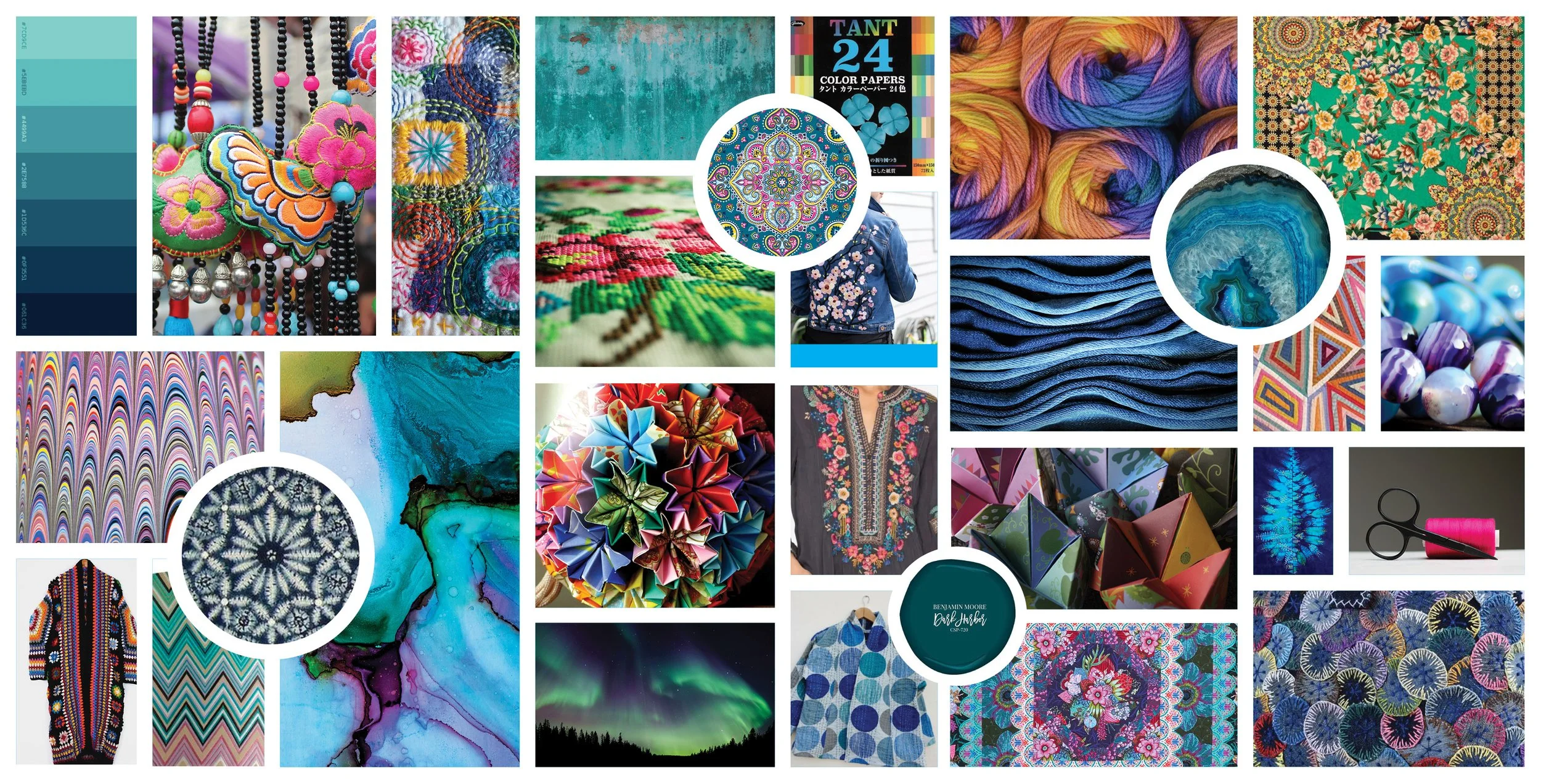
Moodboard

Competitor analysis comparing publisher logos and color schemes
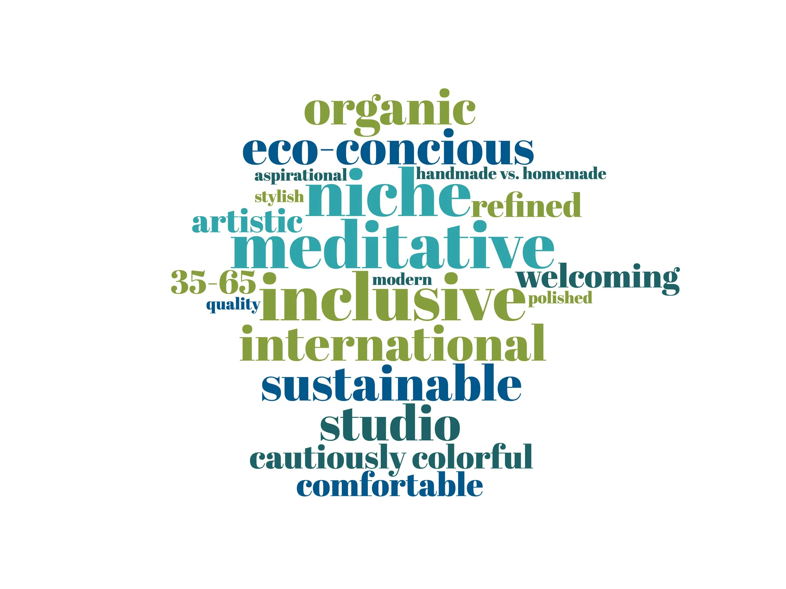
A word cloud guided the overall look and feel of C&T's logo and color palette, with key terms like inclusive, welcoming, and aspirational.
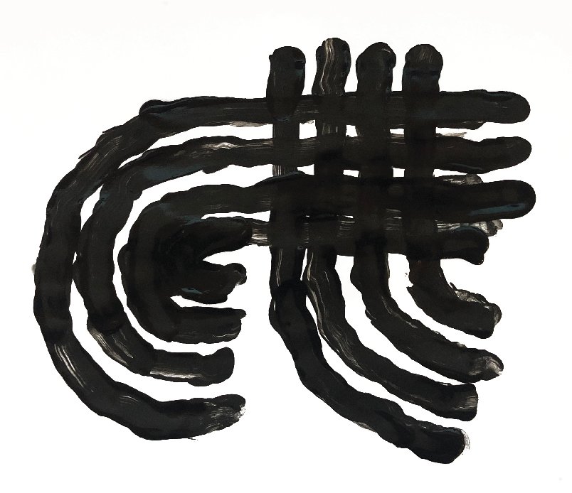
The four lines that make up the strokes in the letter are symbolic of finger marks- that mark that one would make on a finger painting if using all fingers. The simplicity and tight geometry of the stroke symbolizes a confident, expert mark. I chose finger marks to represent the variety of crafts that C&T is now promoting.
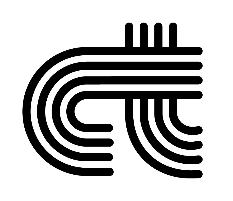
Final logomark rendering
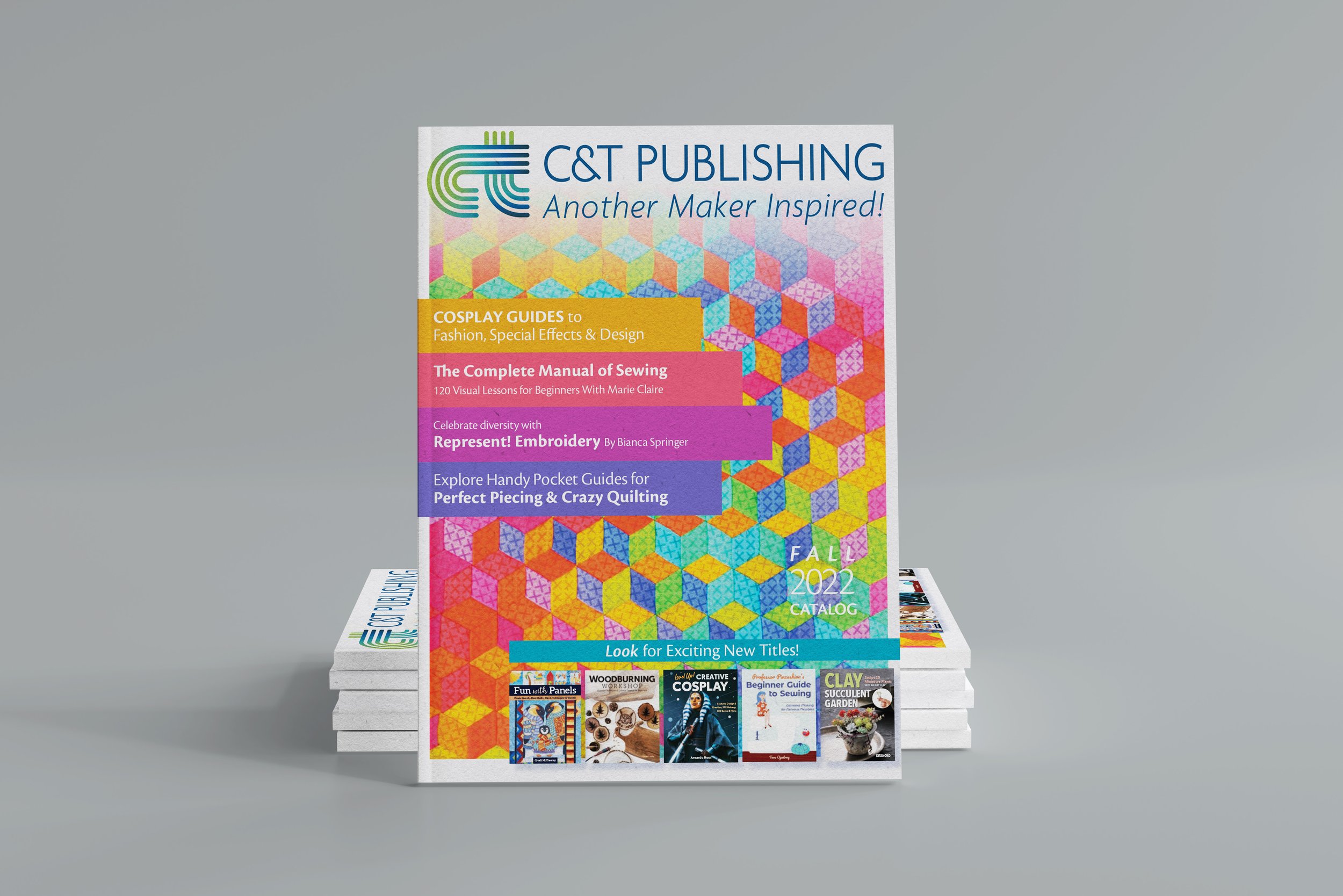
Catalog, Fall 22 featuring new branding
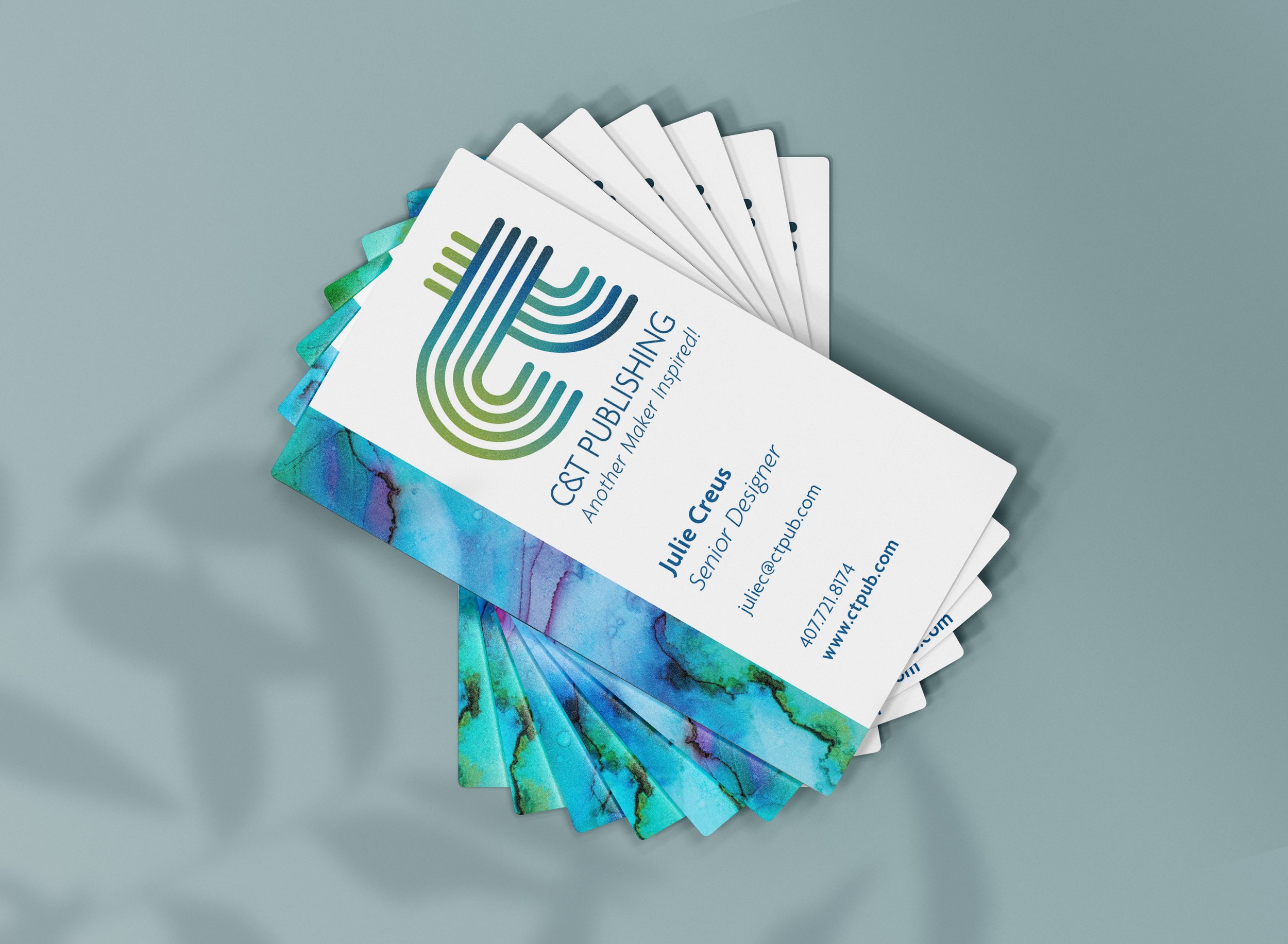
Business Cards
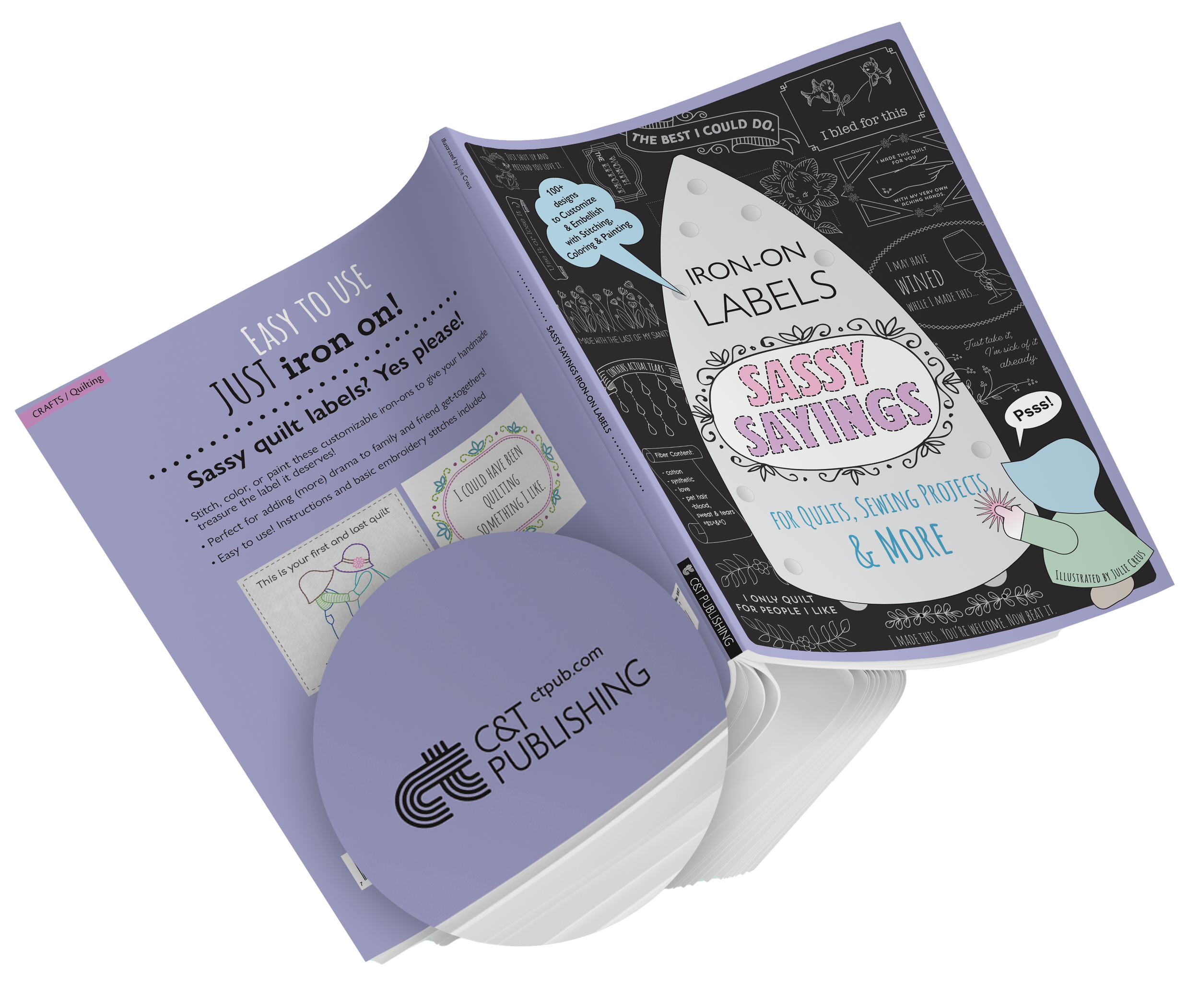
Logo on book verso

Branded Instagram post
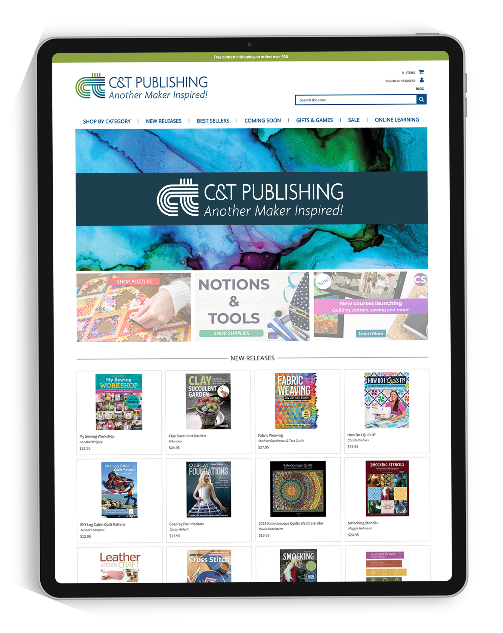
Website header and banner